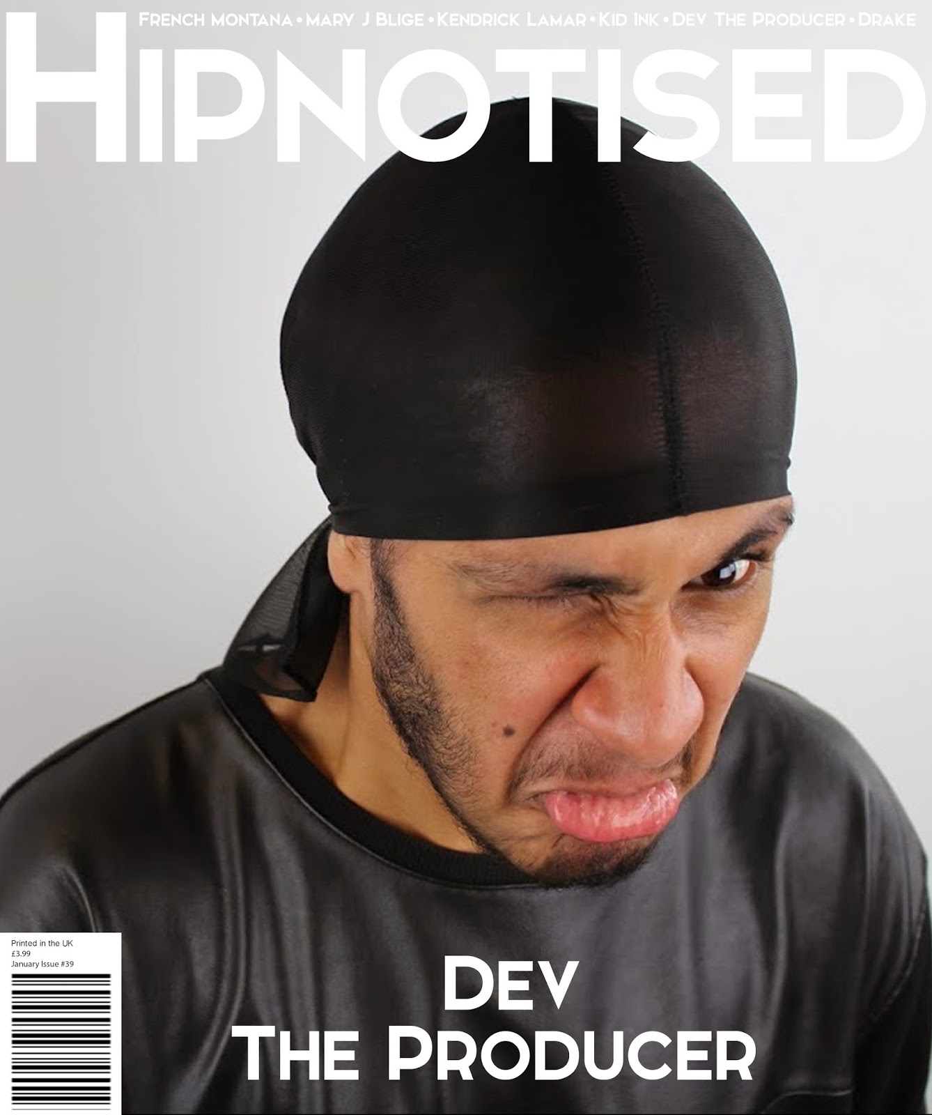
I think that I made my front attractive towards the target audience by making it simple and effective. I did this by stripping away all the unnecessary information around the cover photo, this is because I think that it gives a messy look to the magazine and I don't think that it would be attractive.
With my contents page I kept it clean and simple this is because, I didn't want the whole contents to be an image of an artist and then text on top. For me this defeats the concept of a contents page as it gives you minimal information, and therefore the reader will have to flick through the pages to find what they are looking for.
My double page spread I think is the highlight of my magazine as it has clean crisp lines and a simple layout which is effective as it is easy to read. I think that this will attract the audience as it isn't in their face and therefore they will pick my magazine as it is more sophisticated yet gives more detailed information in a better way.
Wednesday, 18 March 2015
DRAFT EVALUATION 4: Who would be the target for your media product?
Whilst doing my research I came to the conclusion that my music magazine will be aimed at 16-21 year olds this is because I believe that this age range is appropriate as people in this age range will have a definite genre/type of music that they like. I am aiming it at males and females but predominantly males. This is because of the raw style of the magazine and the content as more males listen to Hip-Hop as this is the stronger genre in my magazine. I have also based my magazine off how my target audience interacts with music and how they like to see their favourite artist in concerts, tours and festivals. I have taken this into consideration this so that I can fit the information the magazine, as they also want to know what is new in terms of new albums, tours, events, and concerts. I have chosen the age 21 to stop as this is when most students are completing their graduate year/ college courses at this age, and after this they starts proper job and therefore they might not have time to read into things like this anymore. Also because they will be slightly less interested as they get older because they will have seen their favourite artist and may have gone to their concerts which they will be satisfied with. As they get older they will be less out going and into these seeing their favourite artist live. More females might buy the issue depending on the month as a feature different artists on the cover of the magazine. I don't think that if will affect the sales of the males as the target
Tuesday, 17 March 2015
DRAFT EVALUATION QUESTION 3: What kind of media institution might distribute your media product and why?
Monday, 16 March 2015
DRAFT EVALUATION QUESTION 2: How does your media products represent particular social groups?
.jpg)
When I first started my magazine I wanted to create a RnB magazine and it was targeted at 16-21 year old. But as I finished my research I realised that I wanted to include Hip-Hop as well in my magazine, while I was doing my research. I then changed my target audience by adding Hip-Hip as well as RnB this is because as I listen to both, I think that they are sort of similar and many people would listen to both. I wanted to make sure that type combination of RnB and Hip-Hop would fit and attract my target audience of 16-21 year old which are members of the Hip-Hop/RnB genre and social groups. Knowing what type of audience I am aiming at makes it easier to design my magazine around them. This is because as I fit into this genre and social group I know what sort of content is relevant in terms of the magazine. Also some of my research was carries out on a website called UK Tribes; this website gives information on a wide range of social groups which youth members fit in from indie/rock to Hip-Hop. One UK Tribe that stood out was DIYers which are part of a bigger group called the 'Leading Edge' they do everything music and even make beats in 'their bed room studios.' This means that they are always on the latest beast and music trends in the Hip-Hop world. The research describes them as 'motivated, proactive, influenced and resourceful.'
From this research I will make sure that in my magazine I encourage the readers to be Influenced and be motivated by the content in the magazine by being having content which is inspirational. By choosing 'Dev the Producer,' I will be encouraging and inspiring the readers as he used to be like the DIYers social group making and listening to music all the time. I feel like this is appropriate as he would be nothing without his fans, and also because he was inspired to do this. The way that Dev dresses is similar to their style as they he likes to wear black sweatshirts with grey joggers and just likes to 'chill.' This all represents my target group as they are minimal and don't like to stand out as much but want to be heard. My artist 'Dev' is 19 years old and I am comparing him to is Earl Sweatshirt he is 21, and an American rapper-producer and member of the Los Angeles-based hip hop collective Odd Future. As you can see I have dressed my artist in more monotone colours like Earl, this is so it gives it more of a neutral look, and also more of a professional and cleaner look. A difference is which I made to set my magazine apart from the rest is that my artist is pulling a face which isn't 'normal' in magazine as they have a photo of the artist posing or looking at something. The reason why I did this is because it sets itself apart from the rest of the magazines as it is unusual and uncommon. Styling my artist the way Hip-Hop and RnB artist dress in all black, allows audiences to familiarize themselves to the magazine as it they are used to it as it is 'normal' for them to see artist dressed like this. Throughout my magazine I have also represented by social group in my article as I have dressed him up using very simple monotone colours and typical clothing which Artist would wear like branded clothing. This would allow the readers to be familiar with the content and therefore would attract customers.
DRAFT EVALUATION QUESTION 1: In what way does your media product use to develop or challenge forms and conventions of real media products?


My magazine masthead 'Hipnotised' I feel is quite original as it is sort of a play on words. This is because I have used an 'i' instead of a 'y' when spelling it. The reason why I did this is because my magazine is based on Hip Hop.

The font I used is 'Elkwood' which I downloaded from the website Dafont.com. I felt that this font was relevant for my magazine as it is loud, bold and stands out from the rest of the magazine. I chose this as my brand name is it is not too long to remember or say and as it contains the word 'Hip' from Hip Hop I thought that it might be recognisable. Also another reason why I chose this name is because I feel that people might be 'hypnotised' into the content of the magazine. I want it to come across as a magazine which people can compare it to and enjoy when reading. Because of the price I want it to more of a premium magazine which is a type of luxury for people to have, when they catch up with the latest music related news. I wasted to keep my magazine simple and clean as it gives it a more premium look and feel, and I didn't want it to complicated and 'flooded' with information, because the reader might be overwhelmed with all the information on the cover and lose interest because of this. It is clean crisp and easy to read, this is because it has to big and clear so that it catches the eye of the magazine reader. I feel that my magazine title is similar to the ones one the market such as NME, FADER and LOUD AND QUIET.
I wanted to go for a simple but effective theme and therefore the colour ‘white’ gave me a simple yet “pure” look to my magazine. Because I chose the white backgrounds through my magazine it allowed the important information like artist names, article titles, and sections of news to highlight themselves. In my contents I chose the size of my fonts depending upon the importance of the information. By doing this I am able to order and break things down so that it would be sections which are much easier to reading the whole list. I decided to keep my magazine very simple and basic like other magazines in the market ‘Loud and quiet’ &‘THE FADER’ & ‘Vice’, ensuring that there is not too much on the page. With my contents page I kept a flat design instead on making it more 3D, for example 'V' magazine has focused their contents page more on the artist by making the whole contents page the image and then placing all of the information around the artist, and also making the font smaller so this results in more attention focused on the picture then the actual information the contents provides. I wanted to keep my contents page simple and by using the monotone colours and the filter on the pictures, this is because I didn't want a central piece for the contents page. I feel that this would detract from the whole content and therefore it defeats the objective of a contents page. This is why I included more than one image on the contents page to break up the text from the picture and so that it has a clean setup. By making 'Dev the Producer' a little bit bigger on the contents page I was able to emphasis that he is a big deal as he is on the cover, also because we have an interview with him. Whereas the other images are hinting what he magazine will be about, which the reader will understand as the have page numbers at the bottom of the pictures. I think that this fits my audience as they like simple things because it is more premium then the standard magazine.
When I initially did the second photo shoot I knew what I had in mind, as I have learnt from the first photo shoot, I wanted to make my music artist different so when people look at the cover of the magazine they will immediate be eye-catching and draw them in as it is unusual to have them pulling a face. I think that this is an effective way of presenting artist as it draws the reader in and make then think. When we were doing the photo shoot I had the artist pull different expression and I also took some natural shots. But there was something about the unexpected unusualness of the cover photo I chose then drew me in to it. Also because most Hip-Hop magazines are similar as they have the artist look intimidating or striking a pose, and they all have to artist with neutral faces, sometimes this can get boring, but by having a cover photo like this is immediately draws attention to itself as it isn’t ‘normal’. I feel like my model fits the magazine age range, and target audience well, as he doesn’t seem out of place and suits the role well as I am producing a Hip-Hop magazine. The genre is clear throughout my magazine as it is presented through the cover, contents and double page spread. I feel like the simple monotone layouts like ‘THE FADER’ suit this type of magazine as it is more ‘premium’ and sets itself apart from the rest of the magazines on the market in this genre.
Friday, 13 March 2015
Subscribe to:
Posts (Atom)


