Tuesday 14 April 2015

Final Evaluation Question 2:


How does your media products represent particular social groups?


When I first started my magazine I wanted to create a RnB magazine and it was targeted at 16-21 year old. But as I finished my research I realised that I wanted to include Hip-Hop as well in my magazine, while I was doing my research. I then changed my target audience by adding Hip-Hip as well as RnB this is because as I listen to both, I think that they are sort of similar and many people would listen to both. I wanted to make sure that type combination of RnB and Hip-Hop would fit and attract my target audience of 16-21 year old which are members of the Hip-Hop/RnB genre and social groups. Knowing what type of audience I am aiming at makes it easier to design my magazine around them. This is because as I fit into this genre and social group I know what sort of content is relevant in terms of the magazine. Also some of my research was carries out on a website called UK Tribes; this website gives information on a wide range of social groups which youth members fit in from indie/rock to Hip-Hop. One UK Tribe that stood out was DIYers which are part of a bigger group called the 'Leading Edge' they do everything music and even make beats in 'their bed room studios.' This means that they are always on the latest beast and music trends in the Hip-Hop world. The research describes them as 'motivated, proactive, influenced and resourceful.'

From this research I will make sure that in my magazine I encourage the readers to be Influenced and be motivated by the content in the magazine by being having content which is inspirational. By choosing 'Dev the Producer,' I will be encouraging and inspiring the readers as he used to be like the DIYers social group making and listening to music all the time. I feel like this is appropriate as he would be nothing without his fans, and also because he was inspired to do this. The way that Dev dresses is similar to their style as they he likes to wear black sweatshirts with grey joggers and just likes to 'chill.' This all represents my target group as they are minimal and don't like to stand out as much but want to be heard. My artist 'Dev' is 19 years old and I am comparing him to is Earl Sweatshirt he is 21, and an American rapper-producer and member of the Los Angeles-based hip hop collective Odd Future. As you can see I have dressed my artist in more monotone colours like JME, this allows the readers and the social group familiarise themselves with the cover artist as this is how they usually dress. By using the monotone colours it gives it more of a neutral look, and also more of a professional and cleaner look. A difference which I made to set my magazine apart from the rest is that my artist is pulling a face which isn't 'normal' in magazine as they have a photo of the artist posing or looking at something. The reason why I did this is because it sets itself apart from the rest of the magazines as it is unusual and uncommon. Styling my artist the way Hip-Hop and RnB artist dress in all black, allows audiences to familiarize themselves to the magazine as it they are used to it as it is 'normal' for them to see artist dressed like this. Throughout my magazine I have also represented by social group in my article as I have dressed him up using very simple monotone colours and typical clothing which Artist would wear like branded clothing. This would allow the readers to be familiar with the content and therefore would attract customers. By what the artists on the cover and, contents page and double page spread wear, their look and they way they speak ( through the interview) all represents the social group as this is 'typically' how they would do it with all of their individual touches which they like. I think that as a HIP HOP/RnB magazine people will know what genre of music the magazine just by looking at the cover.

Monday 13 April 2015

Final Evaluation Question 1

In what way does your media product use, develop or challenge forms and conventions of real media products?

My magazine masthead 'Hipnotised' I feel is original as it is a play on words. This is because I have used an 'i' instead of a 'y' when spelling it. The reason I took this decision is because my magazine is based on Hip Hop and Rnb and not just RnB. I chose this as my brand name as it is not too long to remember or say and I thought that it will be recognisable and as it contains the word 'Hip' from Hip Hop. Also another reason why I chose this name is because I feel that people might be 'hypnotised' into the content of the magazine.


The font I used is 'Elkwood' which I downloaded from the website DaFont.com. I felt that this font was relevant for my magazine as it is loud, bold and stands out from the rest of the magazine. I want it to come across as a magazine which people can compare to others and enjoy when reading. As I set the price to £3.99, I wanted it to be more of a premium magazine which is a type of luxury for people to have. They can catch up with the latest music related news. I wanted to keep my magazine simple and clean as it gives it a more premium look and feel, and I didn't want it to be complicated and 'flooded' with information on the cover or contents. This is because the reader might be overwhelmed with all the information on the cover and lose interest due of this. It is clean crisp and easy to read, this is because the font is big and clear so that it catches the eye of the reader. I feel that my magazine title is similar to the ones one the market such as 'NME' & 'THEFADER' & 'LOUD AND QUIET', as it is bold and stand out.


I used the same font for the cover line which featured the main artist who where going be in the magazine, this was aligned along the top of the masthead. I made sure that it was visible but also made sure that it didn’t detract from the masthead, this is because after customers have looked at the cover they might be curious to what is in the magazine. I used the colour white which is the same as the masthead this is so that it gives a clean look, and so it doesn't take away any attention from the Masthead. By doing this the masthead would stand out from the rest of the magazine, and will be easily identifiable against other magazines on the market. For the main cover line I used the same font 'Elkwood' this is so that there would be consistency throughout the magazine. I used the same colour (white) so that it also gives it a clean and simplistic look. I kept the cover line quite short as it just says 'Dev the Producer' which was quite important because it was the main story/interview which will be featured in the magazine and therefore it should stand out because he in on the cover. The white colour of the main cover line is powerful and stands out like the masthead because the artist is also the main part of the magazine. I used a black font for the price, date and issue number in the bottom left hand corner. I think that my magazine is quite unique as it isn't the 'standard' size of a magazine. For example most magazines which you find in the shops are the same size roughly A4 size. My magazine is 23cm wide and 27.5cm high, this ratio follows 'THE FADER' magazine as it used the ratio as well, and it isn't the typical size you would find for a magazine in a shop. The reason why I used this ratio for my magazine is because I think that it adds to the experience as it is wider than normal. I think that this adds to the premium feels and suits the price as there isn't a magazine in the UK that appeals to the premium market for this kind of music genre. With the barcode I made it simple, as i like the way 'FADER' presented their barcode, I measured one of their magazine barcode which was 3cm x 3.5cm, I used this style of barcode with the same measurements because I think that it suits magazine as it is a similar size to the 'FADER' magazine. I used font 'Calibri light' on the text above the barcode because it is a minimal font that suits the approach to my magazine. It doesn't detract any attention from the main image or the masthead either.


I wanted to go for a simple but effective overall appearance for my magazine and so the colour ‘white’ gave me a simple yet “pure” look to my magazine. As there where no bright colours which detract from the main image, or lots of text which the reader could get lost in. I chose the white backgrounds through my magazine it allowed the important information like artist names, article titles, and sections of news to highlight themselves. In my contents I chose the size of my fonts depending upon the importance of the information. So I broke the new and other information into sections. By doing this I am able to order and break things down so that it would be easier for the reader to digest rather than reading a massive list of information.  I decided to keep my magazine very simple and basic like other magazines in the market ‘Loud and quiet’ &‘THE FADER’ & ‘Vice’, ensuring that there is not too much on the page. With my contents page I challenged current music magazines by keeping a flat design instead on making it more 3D, for example 'V' magazine has focused their contents page more on the artist by making the whole contents page the image and then placing all of the information around the artist, and also making the font smaller so this results in more attention focused on the picture then the actual information the contents provides. I wanted to keep my contents page simple and by using the monotone colours and the filter on the pictures, this is because I didn't want a central piece for the contents page. I feel that this would detract from the whole content and therefore it defeats the objective of a contents page. This is why I included more than one image on the contents page to break up the text from the picture and so that it has a clean setup. By making 'Dev the Producer' a little bit bigger on the contents page I was able to emphasis that he is a big deal as he is on the cover, also because we have an interview with him. Whereas the other images are hinting what he magazine will be about, which the reader will understand as the have page numbers at the bottom of the pictures. I think that this fits my audience as they like simple things because it is more premium then the standard magazine.


I developed forms of a real media product as some music magazines like 'THE FADER' & 'CLASH' & 'DAZED AND CONFUSED' have simple layouts. But I wanted to take this further and create a central piece which could catch the readers attention immediately. I did this by moving text away from the main image, any text which wasn't related to the cover artist I would have to move it. Magazines such as the 'FADER' have a cover image which takes up the whole front, it has the type of issue next to the tittle and also the issue number below the title. I thought that this was not simple enough as the text is quite big. So with my magazine I put the date and issue number above the barcode which was aligned on the left hand side. Also some magazine include artist which will be featured in the magazine, as a cover line/s, I developed this as well by moving it to the top of the magazine above the title so that it wasn't next to the cover artist face or the main cover line. I didn't want to change the colour of it as it would detract attention from the main image which is the focus of my magazine. When I initially did the second photo shoot I knew what I had in mind, as I have learnt from the first photo shoot, I wanted to make my music artist different so when people look at the cover of the magazine it will immediate be catch their eye and draw them in as it is unusual cover photo to have on magazine. I think that this is an effective way of presenting artist as it draws the reader in and make then think. When we were doing the photo shoot I had the artist pull different expression and I also took some natural shots when Dev wasn't looking this is so that he didn't have to try as hard because smites it is hard to get the right photo when telling the model what to do. But there was something about the unexpected unusualness of this photo which I took, that I really liked and drew me in. Also because most Hip-Hop magazines are similar as they have the artist look intimidating or striking a pose, and they all have to artist with neutral faces, sometimes this can get boring, but by having a cover photo like this is immediately draws attention to itself as it isn’t ‘normal’. I feel like my model fits the magazine age range, and target audience well, as he doesn’t seem out of place and suits the role well as I am producing a Hip-Hop magazine. The genre is clear throughout my magazine as it is presented through the cover, contents and double page spread. I feel like the simple monotone layouts like ‘THE FADER’ suit this type of magazine as it is more ‘premium’ and sets itself apart from the rest of the magazines on the market in this genre. 

Friday 20 March 2015

DRAFT EVALUATION 7: Looking back at your preliminary task, what do you feel you have learnt in the progression from it to the full product?


From my preliminary work I have learnt a lot of skills and how to present my work effectively. I think that I have made a huge improvement from my preliminary magazine to the final product as you can see above. When I was designing and making my preliminary magazine I don't think that the aspect of the magazine and how I would make it appeal to my target audience. I first started out with my flat plans which I had to redraw as I wanted to redesign the magazine by taking into consideration my target audience, who would buy it, how it would represent by brand name 'Hipnotised' and how people would think of t compared to the other magazines on the market, such as 'THE FADER' & 'NME' & 'Q'.

When redesigning my flat plan I had my preliminary magazine print outs with the teachers notes on it so that I could improv on the annotations made. All this helped my make my final media product which you see today. I prefer the simple and clean look of the my final music magazine, whereas my preliminary work the cover line was too big and the second cover line with artists on was positioned over the photo which I didn't like afterwards as it detracts from the overall photo. I took the picture and then edited my putting a black and white filter which didn't work as it made the artist face really bright and almost distorted his features.

Thursday 19 March 2015

DRAFT EVALUATION QUESTION 6: What have you learnt about technologies from the process of constructing this product?

Throughout my research and development process of my music magazine I used a wide range of technologies for the process which helped make my final music magazine product. Some of the software I use I wasn't very confident with because I had never used it before, whereas other equipment I used I am experienced with and therefore could use it without hesitation. But as I developed my magazine I taught myself with some help from others and created the magazine which I see as my best work so far. However I still think that there is a lot that I could learn which I haven't already.

Photoshop: This is the program which I sued the most mainly because I created the whole of my music magazine on. This was the program which I ad no experience with, and therefore when I first started out I was unsure on how to use it. But with a 'basics' class with the teacher and some help from other and mainly research I created my media product. Likewise I still think that I have a lot to learn in terms of the capabilities of the software, and I wish to carry on with the curiosity that I had
which allowed be to experiment with the features of the software.


Blogger: This is the website which we used to present our research and development, which we would evidence and then post so that all our work would be available online. This is a relatively straight forward website as it allows you to customise how your blog looks. You can organise your post so that they are all 'labelled' which helps as it is easier to find a post when you have been posting for a couple of weeks, as it saves time instead of scrolling through all your posts. What also made this website easy to use is that I had used this before to 'blog' my class work. But using it constantly has improved my understanding of it more of the features and also how to presents and embed work on to it.


Google: This is a generic search engine which is very common as most people know how to use it. It is easy to use, and I used this search engine to find out information that I required for my information, when looking up how to do things, looking for examples and finding photos and mages to backup my research.


iMac: Throughout my research and development I used an iMac, this is because it provided me with all the programs and facilities needed to created my media product and also to edit it. By using this iMac it allowed me to create my music magazine to the best of my ability. Also as I own a Windows at home, I am not used to using an iMac, so I wanted to test myself and see how I would cope with using a different operating system. But I found out that it isn't too different to what I am used to so I got the hang of it, and I actually enjoyed some of the features that are exclusive to the iMac.


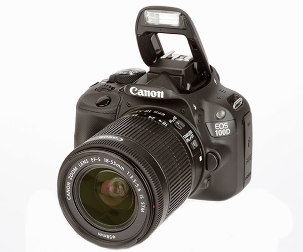
CANNON EOS 100D: The camera that I used is the CANNON EOS 100D to take all my picture both on the preliminary task, draft magazines and final magazine. I am used this camera as I have access to it at home and I am used to the features and the functionality of it and know the capabilities of the camera. As the cameras is a 18 megapixel camera I knew that it would be able to take highly detailed photos shown off in my final media product. I used the CANNON EF-S 18-55mm lens as this is a good all rounder, as the lens is not too wide and not too cropped. This makes a difference because it also gives you the options of optical zoom and it has manual and automatic focus capabilities. I enjoyed using this camera as I think that it allowed me to take the best photos I could being an amateur photographer. Along with the camera I used a SanDisk EXTREME PRO SD card for the photos to be saved on. this is because I was able to remove the SD card from the camera and put it into the iMac, so that I could access the photos directly from the SD card. But the SD card had a speed of 280/s which is fast and therefore I wouldn't have any trouble uploading and extracting photos from my computer or to my computer because of this transfer speed.


Word/Scribd: I used this application because it was easier to type up information which I gathered from my research. By doing this I was able to make sure that it made sense as it has spell check. In junction with application I used the website scribd so that I could embed my documented research onto my blog. A benefit of using scribd is that you are able to embed the document online and also access it anywhere as it is on the internet. This is good for me as I can access it at home and anywhere else if I wanted to quickly edit previous document, and when you edit the document and save it, it automatically updates on the embed document on my blog which is a huge onus instead of re-embedding it every time you make a change.


Google Drive: When researching from home, I used a cloud based service from Google called 'Google Drive' this made it easier to access my work from home and school without carrying a USB stick and keep transferring the documents. It made it easier because all I has to do was sign into Google search engine, which provides more features, at home and at school and it would automatically update the documents which I just had to drag and drop from my home computer or the school computers. This way I didn't have to worry about compatibility issues either.


Dafont.com: When creating my preliminary, first draft magazine and final music magazine I used a website called dafont.com, this website allowed me to install any desired font on their website onto the computer so that I could use it when creating the different magazines. By using this website it allowed me to chose from a wider selection of fonts so that I could pick the best font possible for my media product. All of the fonts which I used in my magazine like the masthead (Elkwood) was downloaded from the website dafont.com.


Power Point/SlideShare: I used this desktop application to gather photos together and save them as a picture so that it was easier for me to present my work. I also used the desktop application to present some of my research information, and by using slideshare I was able to embed the power point into my blog so that it was available on my blog and also because it was another medium for presenting my work.