
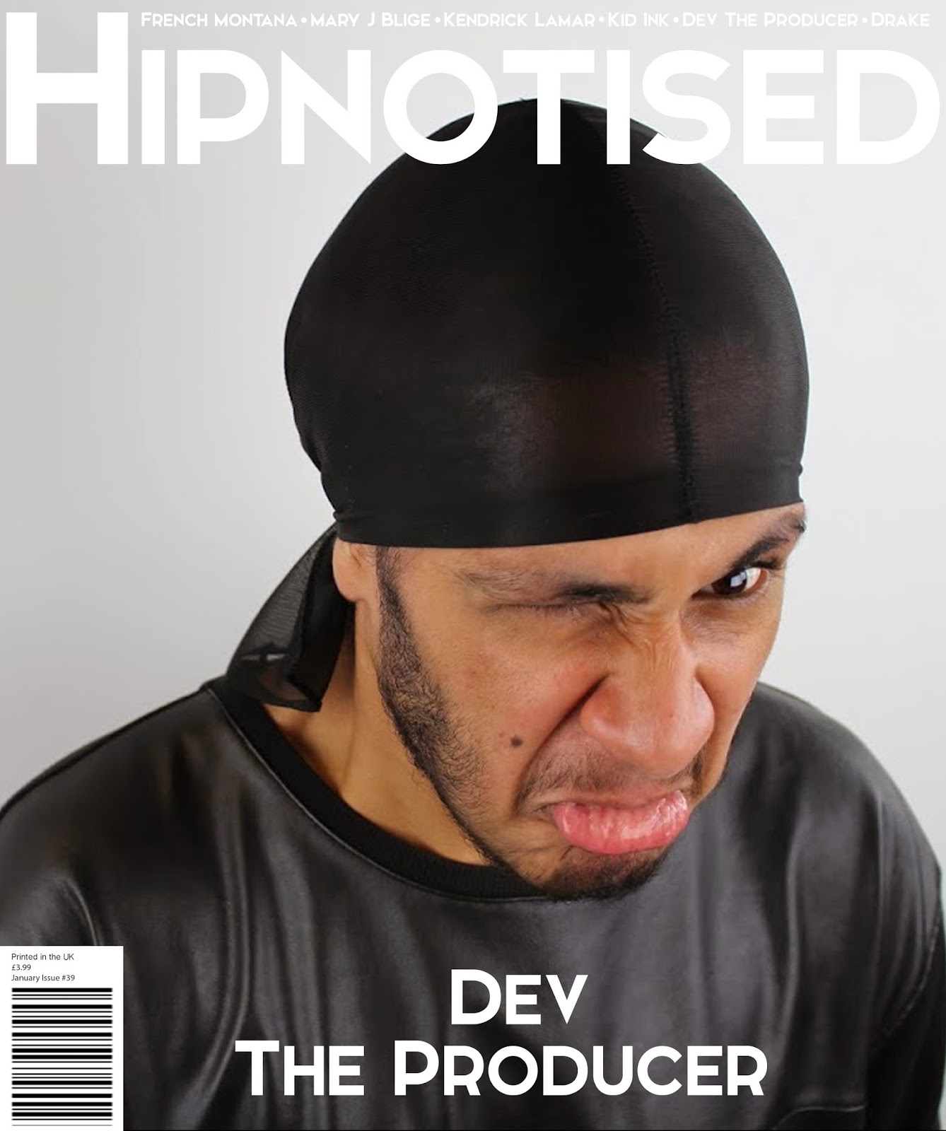
My magazine masthead 'Hipnotised' I feel is quite original as it is sort of a play on words. This is because I have used an 'i' instead of a 'y' when spelling it. The reason why I did this is because my magazine is based on Hip Hop.

The font I used is 'Elkwood' which I downloaded from the website Dafont.com. I felt that this font was relevant for my magazine as it is loud, bold and stands out from the rest of the magazine. I chose this as my brand name is it is not too long to remember or say and as it contains the word 'Hip' from Hip Hop I thought that it might be recognisable. Also another reason why I chose this name is because I feel that people might be 'hypnotised' into the content of the magazine. I want it to come across as a magazine which people can compare it to and enjoy when reading. Because of the price I want it to more of a premium magazine which is a type of luxury for people to have, when they catch up with the latest music related news. I wasted to keep my magazine simple and clean as it gives it a more premium look and feel, and I didn't want it to complicated and 'flooded' with information, because the reader might be overwhelmed with all the information on the cover and lose interest because of this. It is clean crisp and easy to read, this is because it has to big and clear so that it catches the eye of the magazine reader. I feel that my magazine title is similar to the ones one the market such as NME, FADER and LOUD AND QUIET.


I wanted to go for a simple but effective theme and therefore the colour ‘white’ gave me a simple yet “pure” look to my magazine. Because I chose the white backgrounds through my magazine it allowed the important information like artist names, article titles, and sections of news to highlight themselves. In my contents I chose the size of my fonts depending upon the importance of the information. By doing this I am able to order and break things down so that it would be sections which are much easier to reading the whole list. I decided to keep my magazine very simple and basic like other magazines in the market ‘Loud and quiet’ &‘THE FADER’ & ‘Vice’, ensuring that there is not too much on the page. With my contents page I kept a flat design instead on making it more 3D, for example 'V' magazine has focused their contents page more on the artist by making the whole contents page the image and then placing all of the information around the artist, and also making the font smaller so this results in more attention focused on the picture then the actual information the contents provides. I wanted to keep my contents page simple and by using the monotone colours and the filter on the pictures, this is because I didn't want a central piece for the contents page. I feel that this would detract from the whole content and therefore it defeats the objective of a contents page. This is why I included more than one image on the contents page to break up the text from the picture and so that it has a clean setup. By making 'Dev the Producer' a little bit bigger on the contents page I was able to emphasis that he is a big deal as he is on the cover, also because we have an interview with him. Whereas the other images are hinting what he magazine will be about, which the reader will understand as the have page numbers at the bottom of the pictures. I think that this fits my audience as they like simple things because it is more premium then the standard magazine.


When I initially did the second photo shoot I knew what I had in mind, as I have learnt from the first photo shoot, I wanted to make my music artist different so when people look at the cover of the magazine they will immediate be eye-catching and draw them in as it is unusual to have them pulling a face. I think that this is an effective way of presenting artist as it draws the reader in and make then think. When we were doing the photo shoot I had the artist pull different expression and I also took some natural shots. But there was something about the unexpected unusualness of the cover photo I chose then drew me in to it. Also because most Hip-Hop magazines are similar as they have the artist look intimidating or striking a pose, and they all have to artist with neutral faces, sometimes this can get boring, but by having a cover photo like this is immediately draws attention to itself as it isn’t ‘normal’. I feel like my model fits the magazine age range, and target audience well, as he doesn’t seem out of place and suits the role well as I am producing a Hip-Hop magazine. The genre is clear throughout my magazine as it is presented through the cover, contents and double page spread. I feel like the simple monotone layouts like ‘THE FADER’ suit this type of magazine as it is more ‘premium’ and sets itself apart from the rest of the magazines on the market in this genre.
This is much better in terms of using examples to show your production process and how you have made use of your research. Check through your work - there are a couple of expressions that do not work.
ReplyDelete